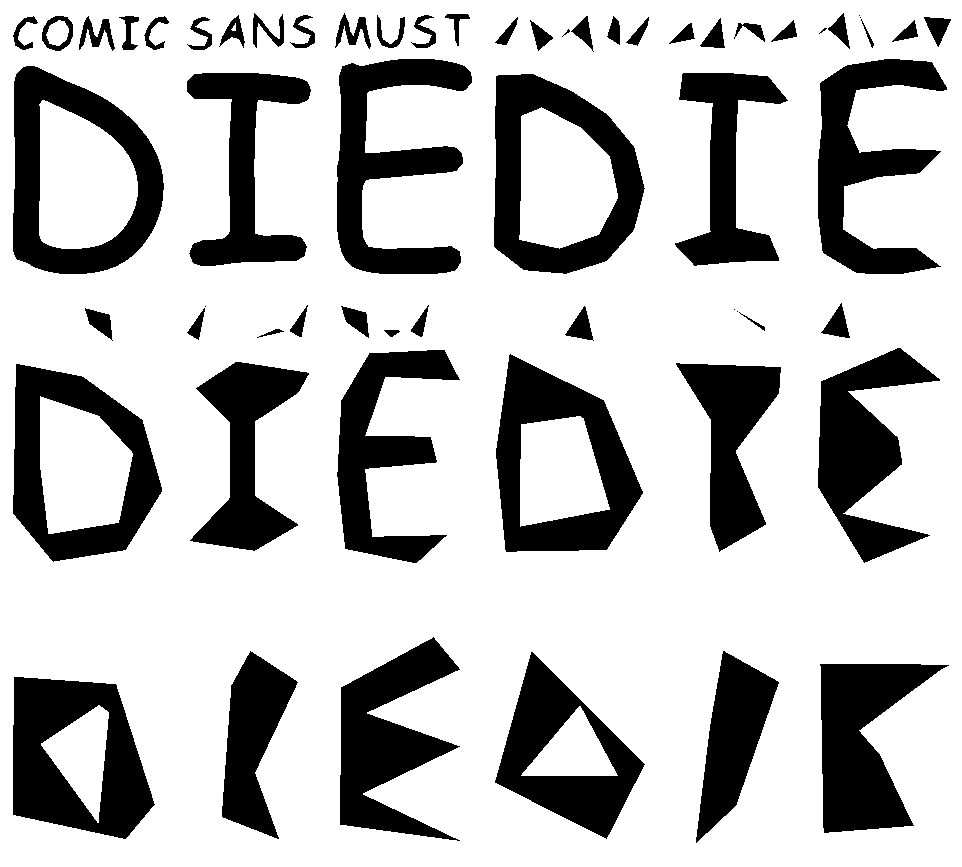
Comic Sans is undoubtedly the most widely known font, but mainly for all the wrong reasons. Ridiculed by designers and developers alike, since it’s inception it has attracted an unprecedented level of hate. Movements to ban it, sites devoted to highlighting improper use have sprung up, often with just cause.
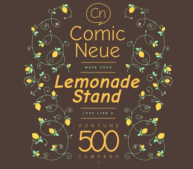
Craig Rozynski however, has just stirred up the comic sans debate again with the release of his new typeface: Comic Neue. In an interview with Creative Review, Craig describes the new font as such:
I simply set out to fix the weirdness. I still wanted it to be a casual typeface. I still wanted it to be Comic Sans, but a version you couldn’t easily fault. Make people question their assumptions.
Keeping true to the playful nature of the original but adding some refinement Craig’s aim is to legitimise the use of Comic Neue. However, predictably there’s been a number of alternative views on the situation:
It’s shite “@HuffPostTech: Someone created a slightly less horrible version of Comic Sans (http://t.co/1jkPe4UGVC) pic.twitter.com/bRp7eaVkj1”
— Vincent Connare (@VincentConnare) April 7, 2014
Finally someone fixed Comic Sans and it looks nice :) http://t.co/H23pvdiEkW
— Pasu (@Pasu2k) April 15, 2014
Love it? Hate it? A Neue Font We Don’t Need: Comic Neue. http://t.co/c9DUIclNnu
— DesignObserver (@DesignObserver) April 17, 2014
Comic Neue is free to download and try out here.


