Design studio 1910 published a great article this week where they reimagined the typical email client, with a focus on typography.
Arguing that the email apps of today, both on the web and mobile, have not kept up with the changes in display technology. Email clients typically use smaller font sizes, around 12px, but as pixel sizes have decreased relatively and monitor sizes increased, such small fonts are now out of place and hinder the reading and writing experience.
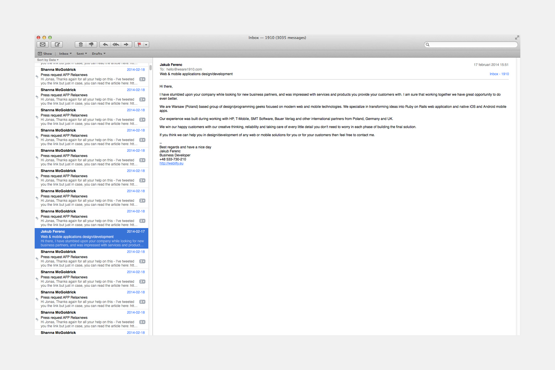
1910 offered this example of the current state of email applications:
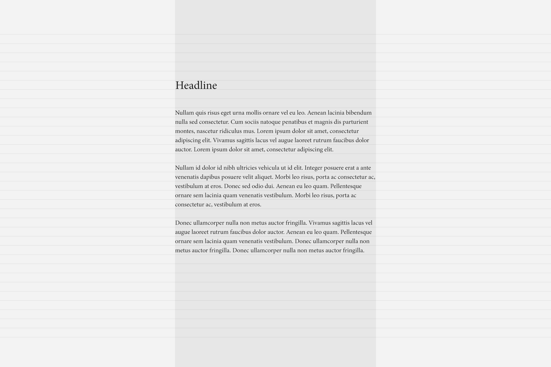
Describing their design process, 1910 tells us how they design with typography first, grid second. Showing how the content is the most important element:
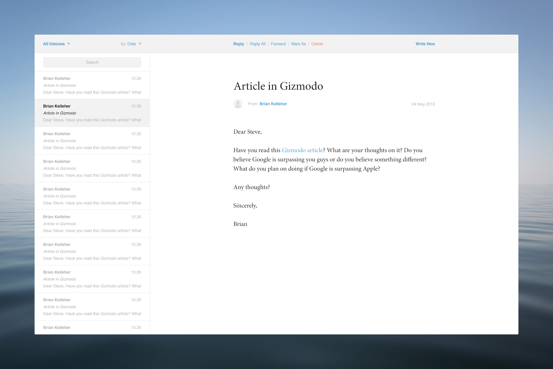
Adding more UI elements brings the client together:
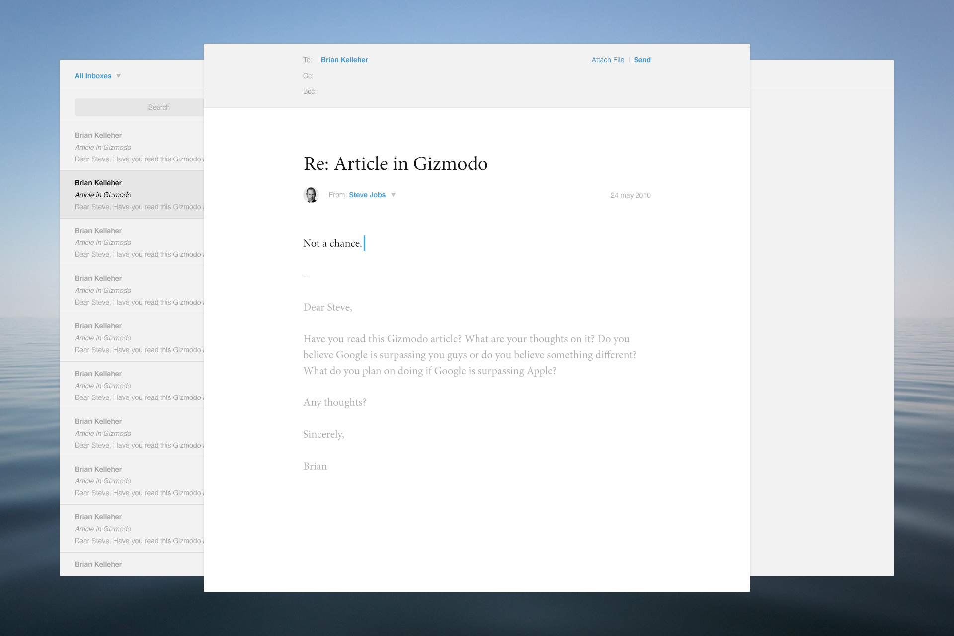
And finally, the composition view:
1910 have been careful to state that this is merely a mockup and a functioning email client would likely need to look much different.
We’ve also found the now defunct Sparrow.app and the new Airmail.app to bring good design to email, and would recommend trying it out (OS X only).