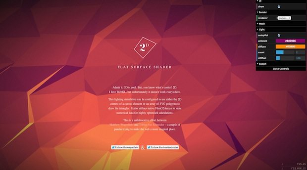
Low Poly or Polygon design has become something of a trend recently; a natural extension of flat design, low poly design is the use of simple, colourful polygons to imitate an object or used as a background.
Whilst the style has traditionally been found in retro style video games – which are often restricted to lower polygon counts either due to available system resources or for aesthetic purposes – many graphic and web designers have begun experimenting with the design style. You can read more about the history of low polygon meshes on this wikipedia article.
Let’s take a look at some of the best uses of low poly in web design at the moment:
1. SouthPole
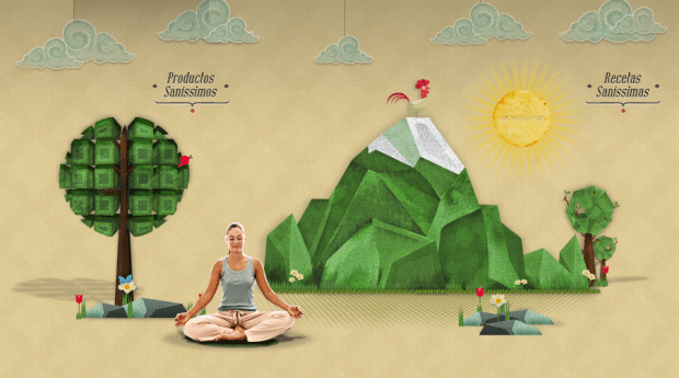
2. Sanissimo
3. WebDiv

4. Letters
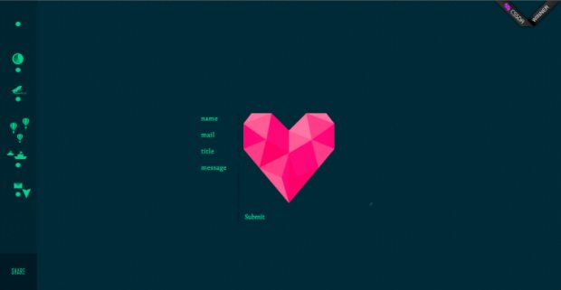
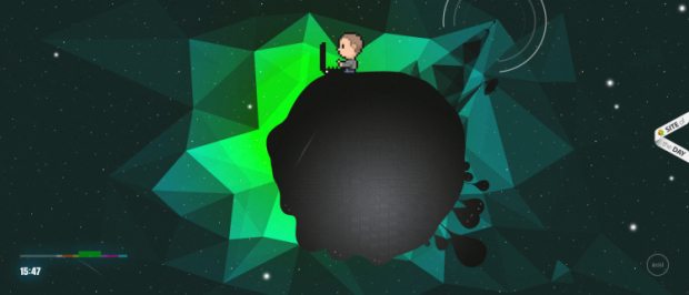
5. Galaxy
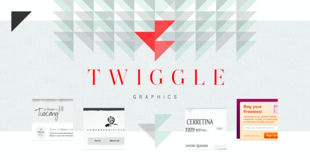
6. Twiggle
7. GPLclub
8. Pandra
10. HotDot
11. Pharrell
All pretty awesome right? But how do you go about creating low poly style elements? For starters there are two sites that currently generate semi unique low poly backgrounds:
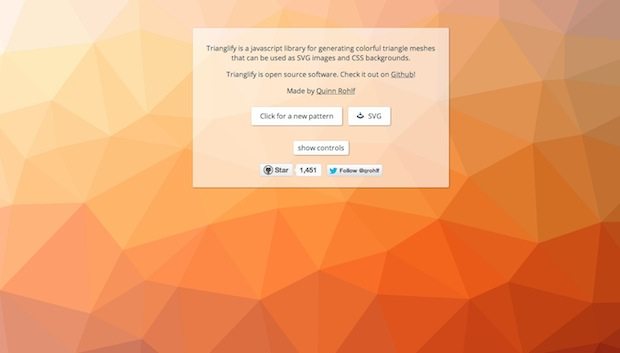
2. Trianglify
Also see these articles for some good tutorials on low poly-fying images.

